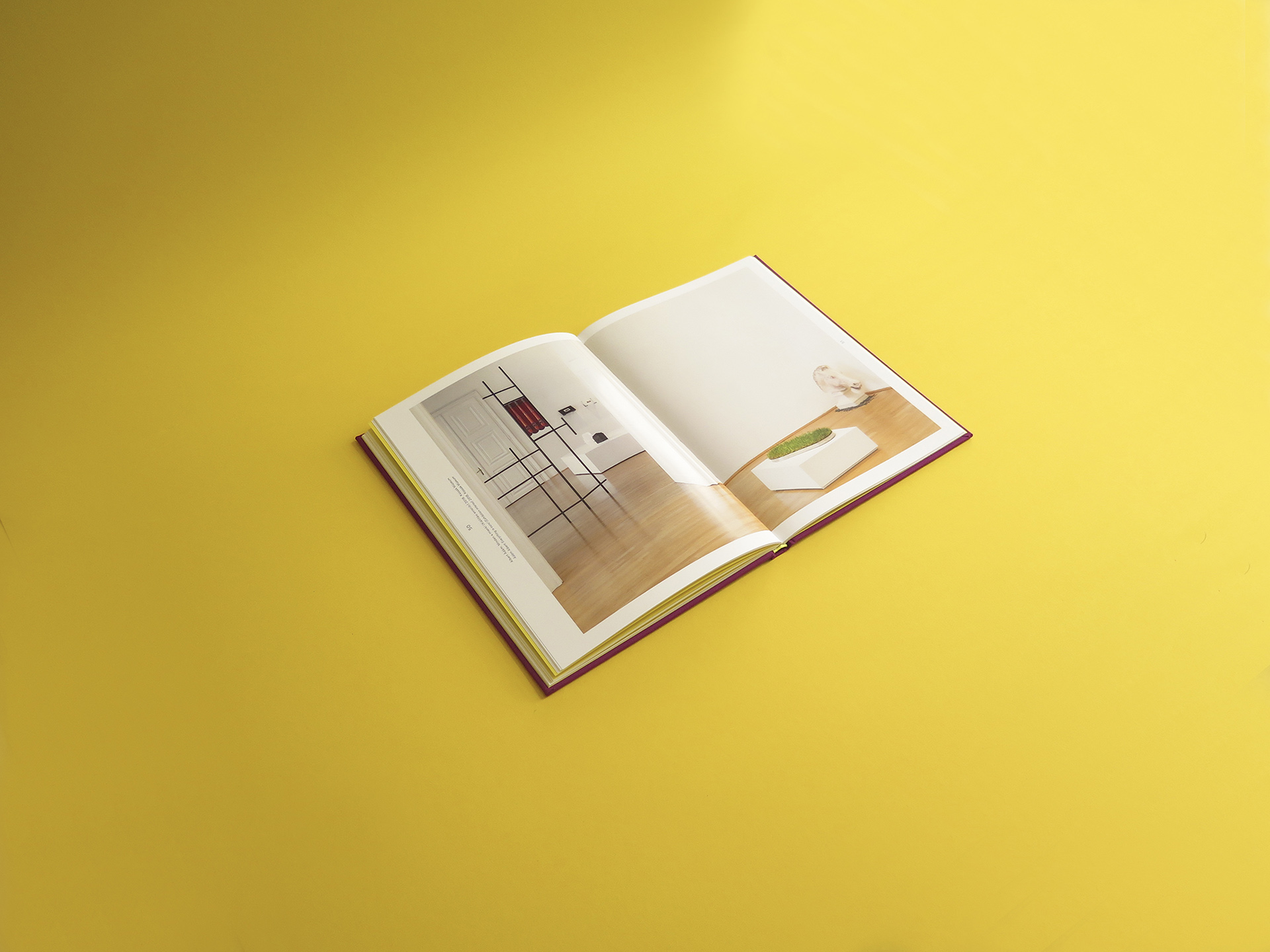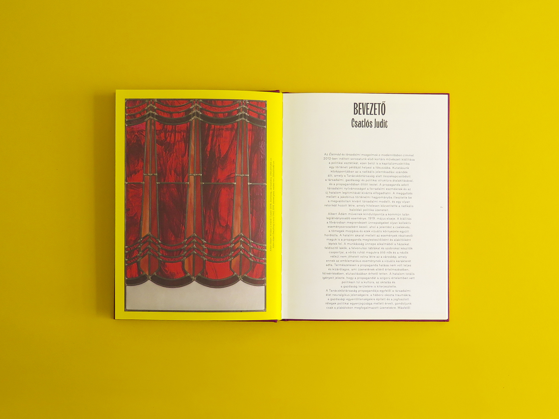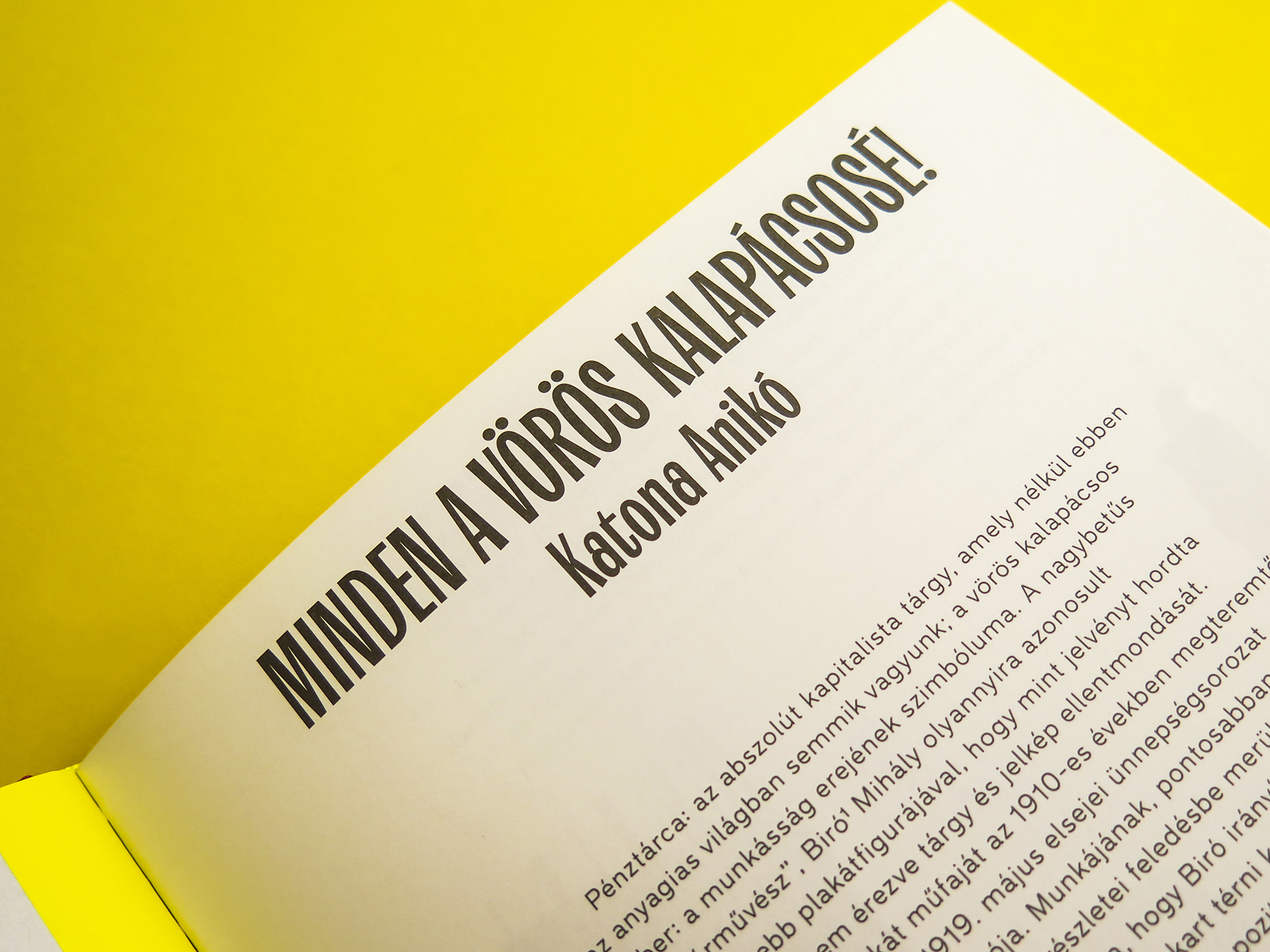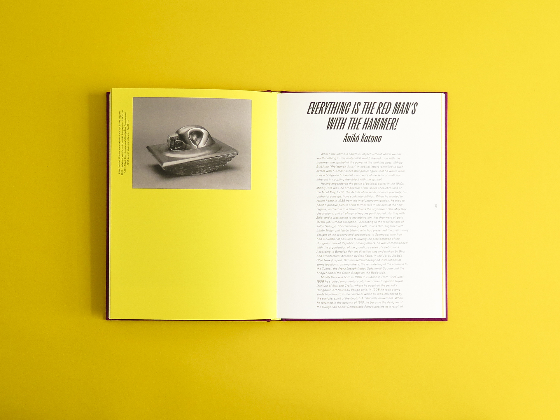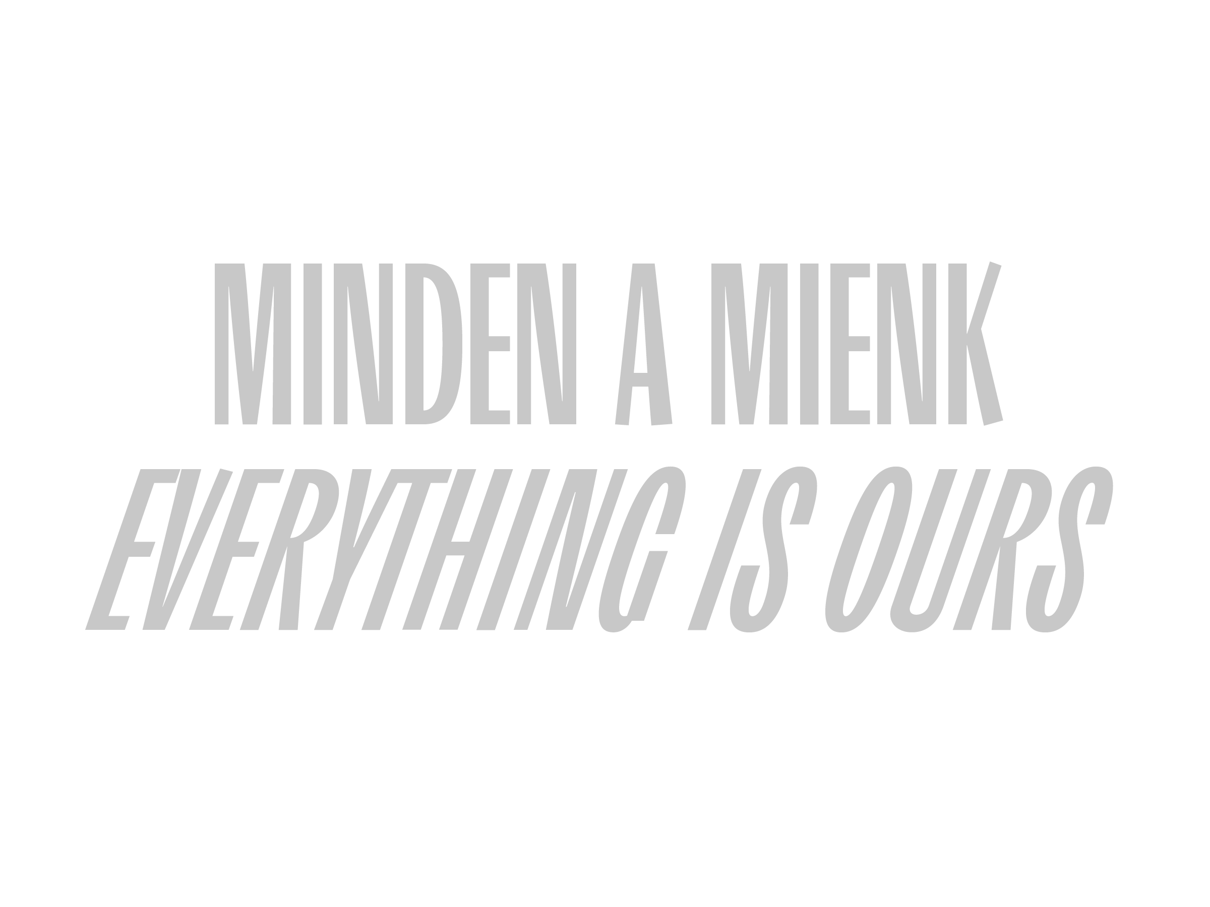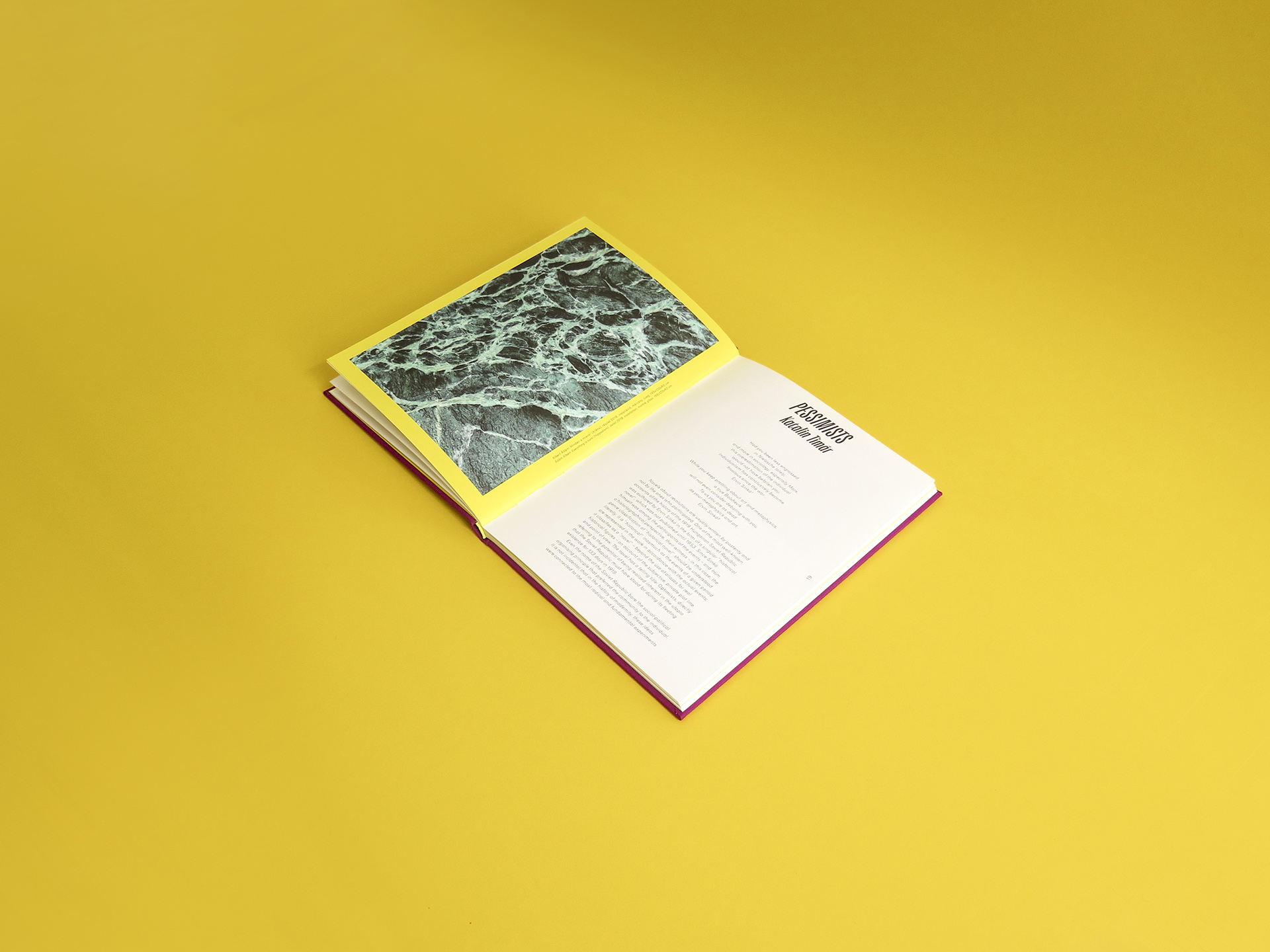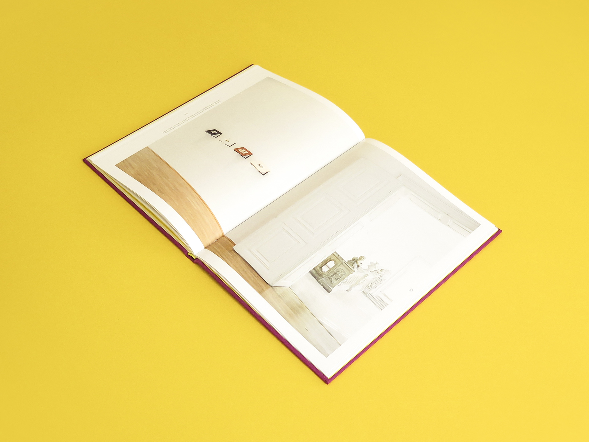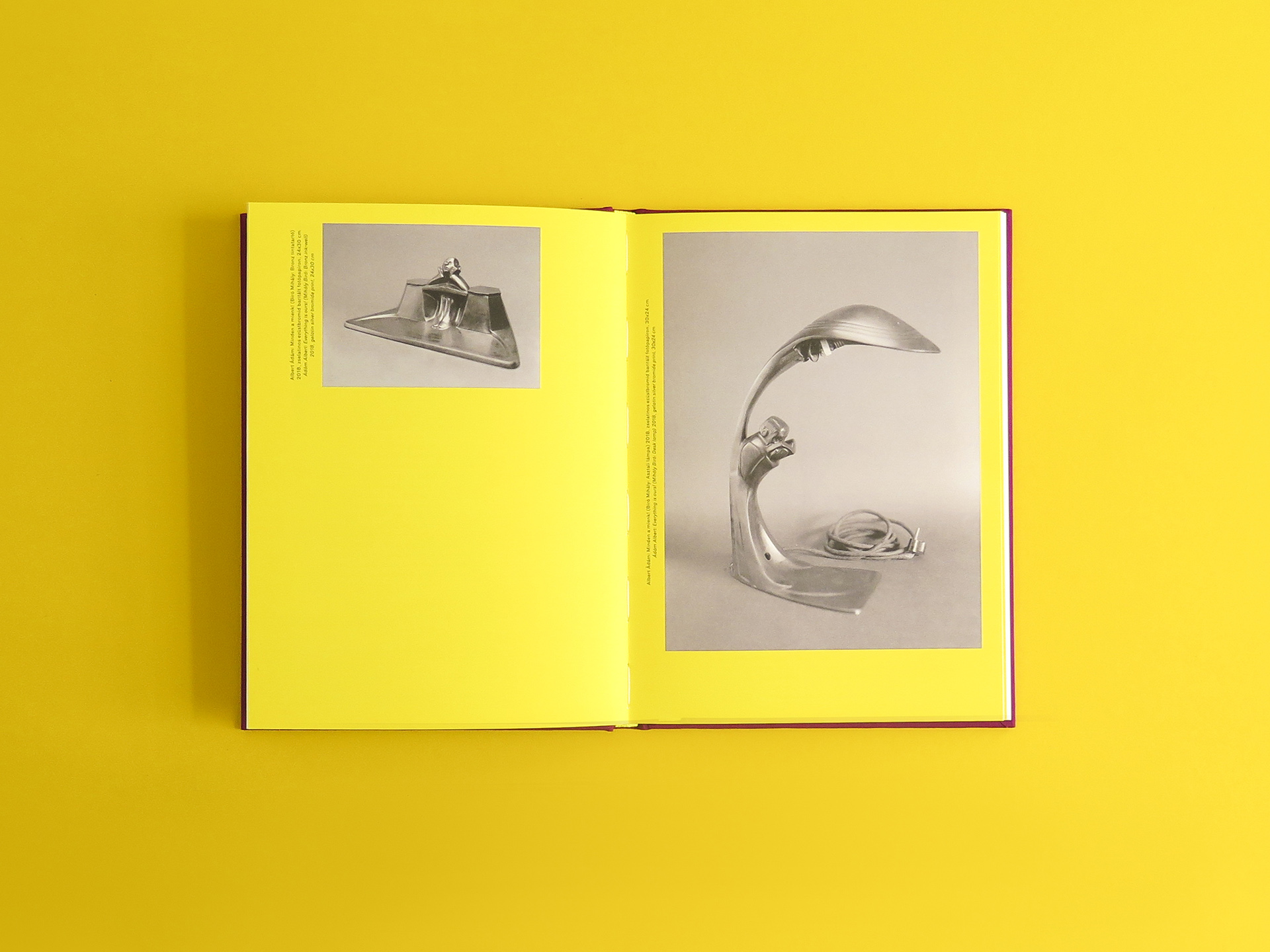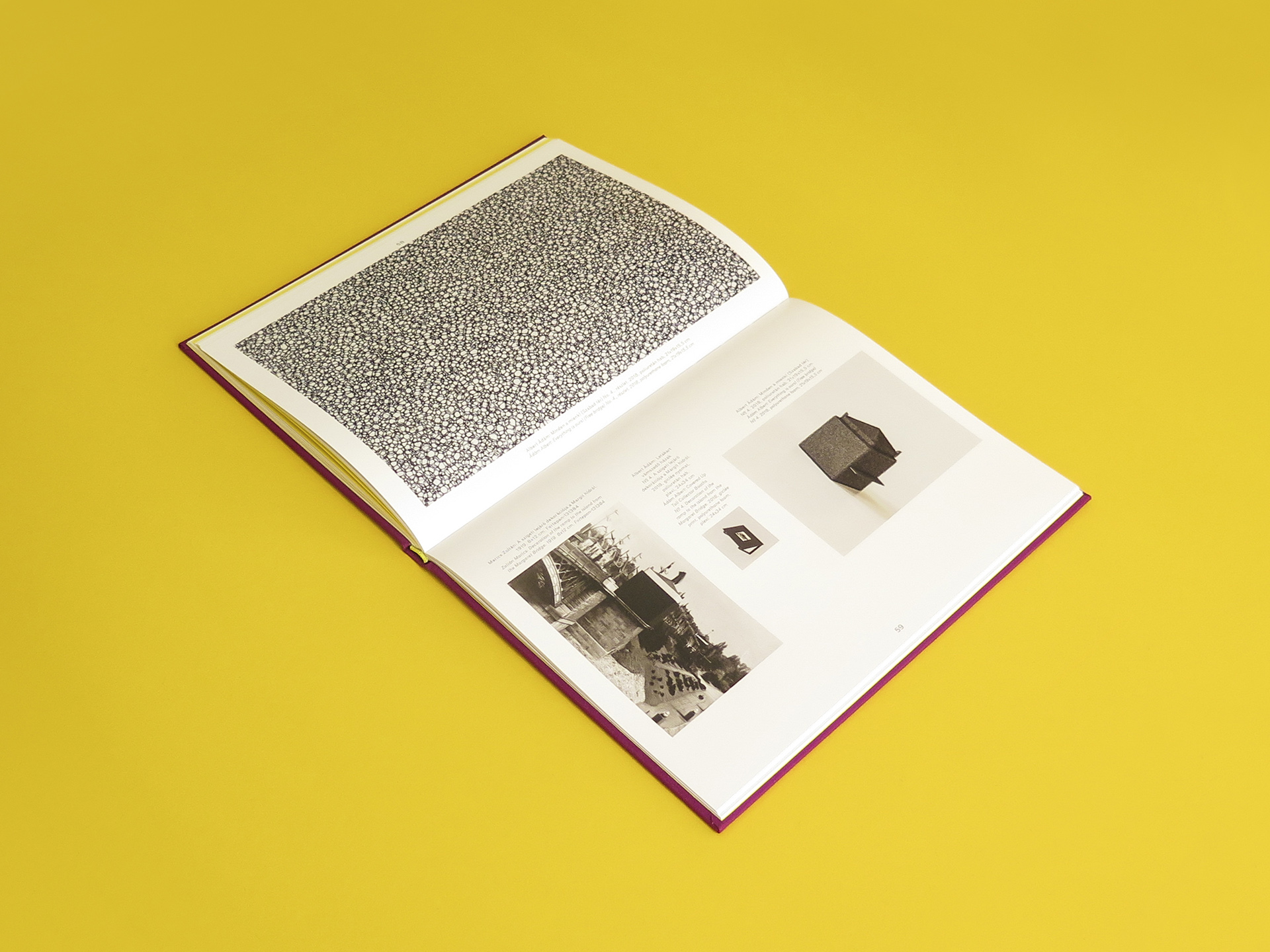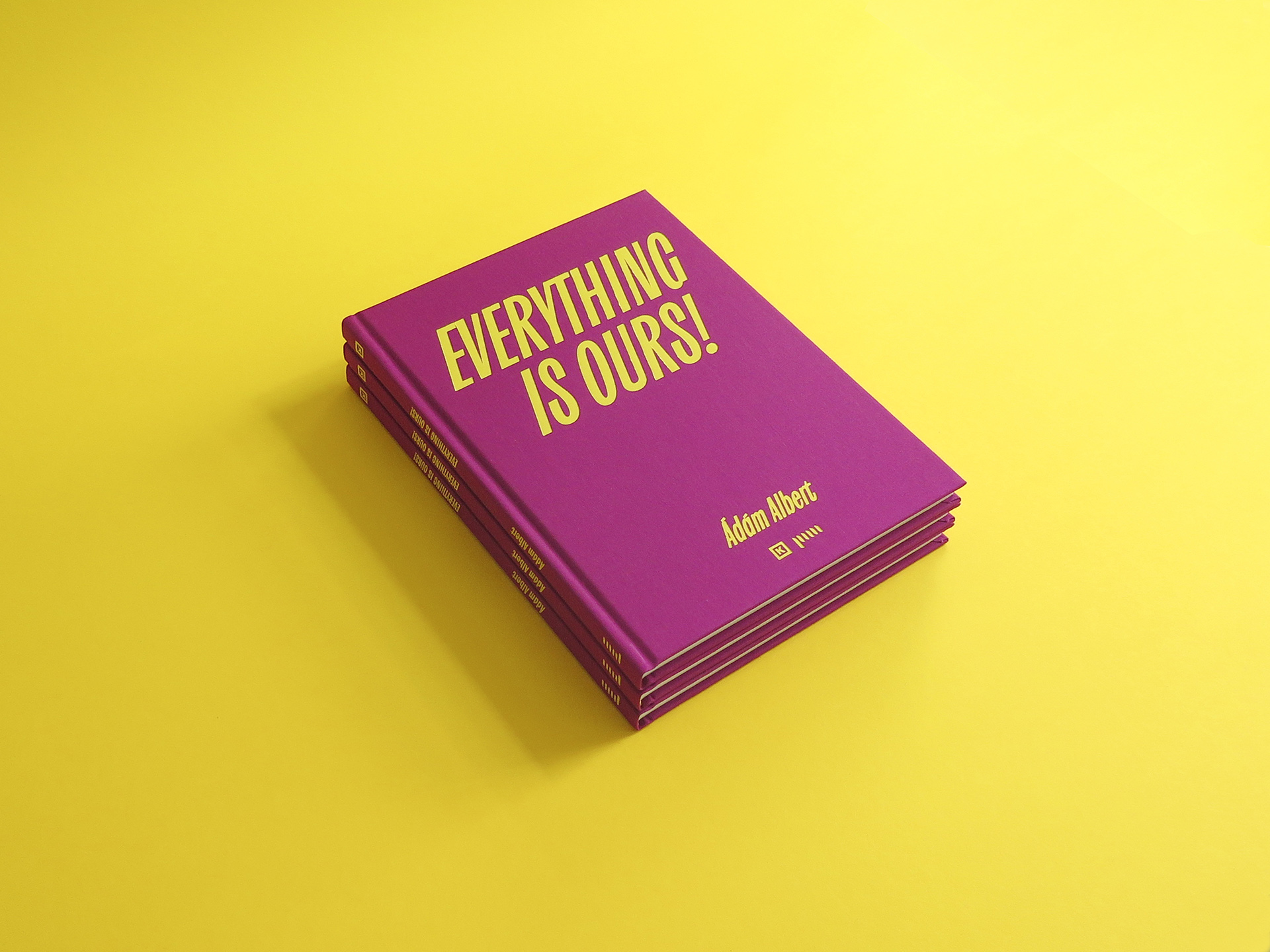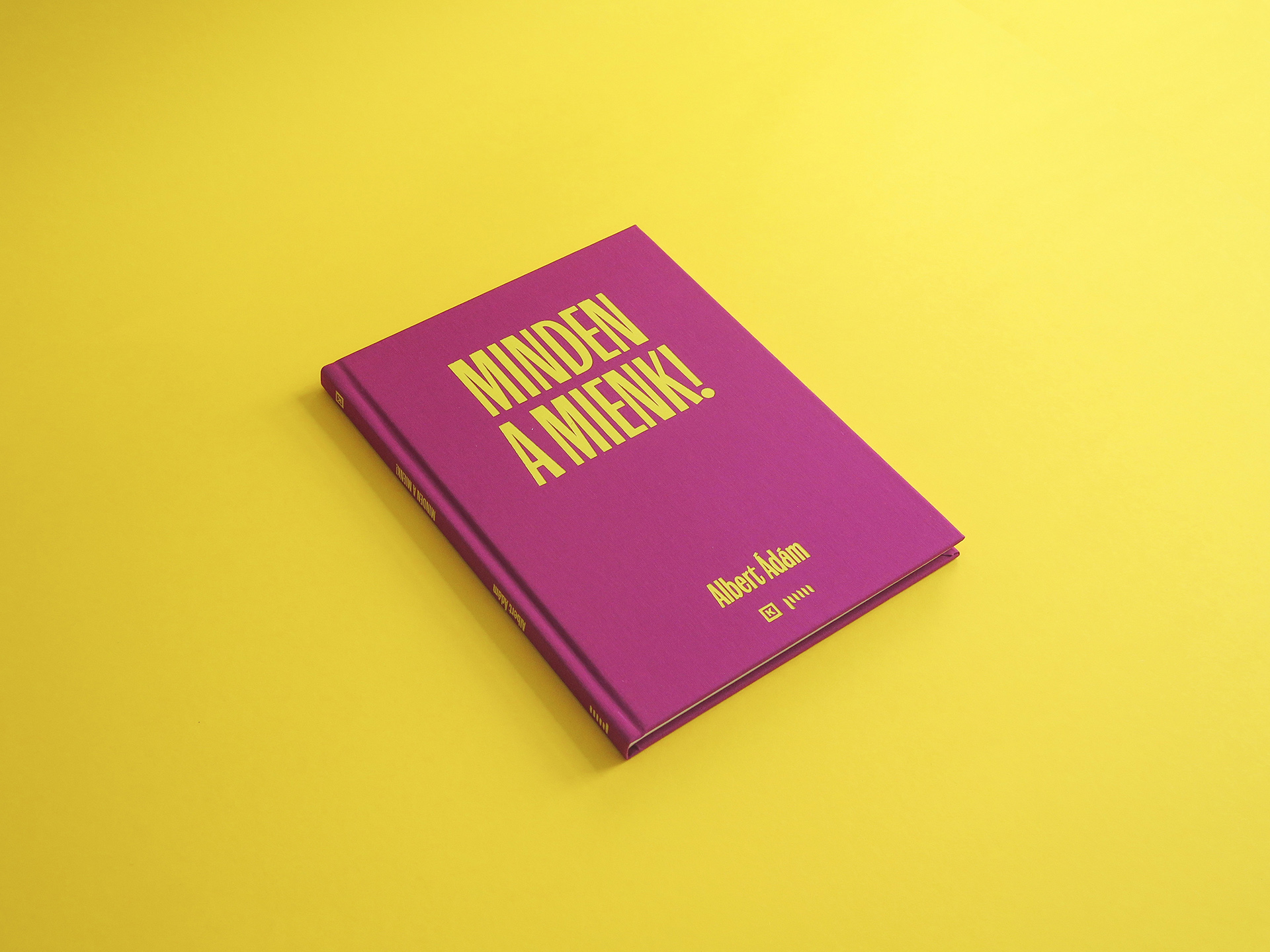
Custom typeface- and book design for Adam Albert's Everything is ours! exhibition
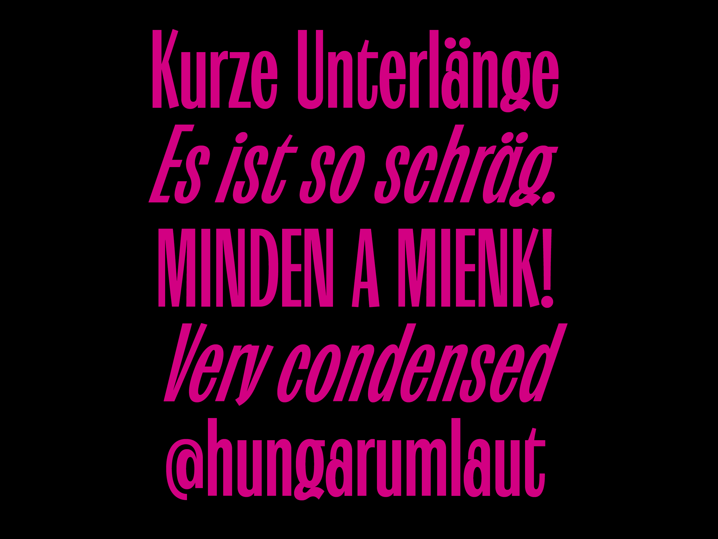
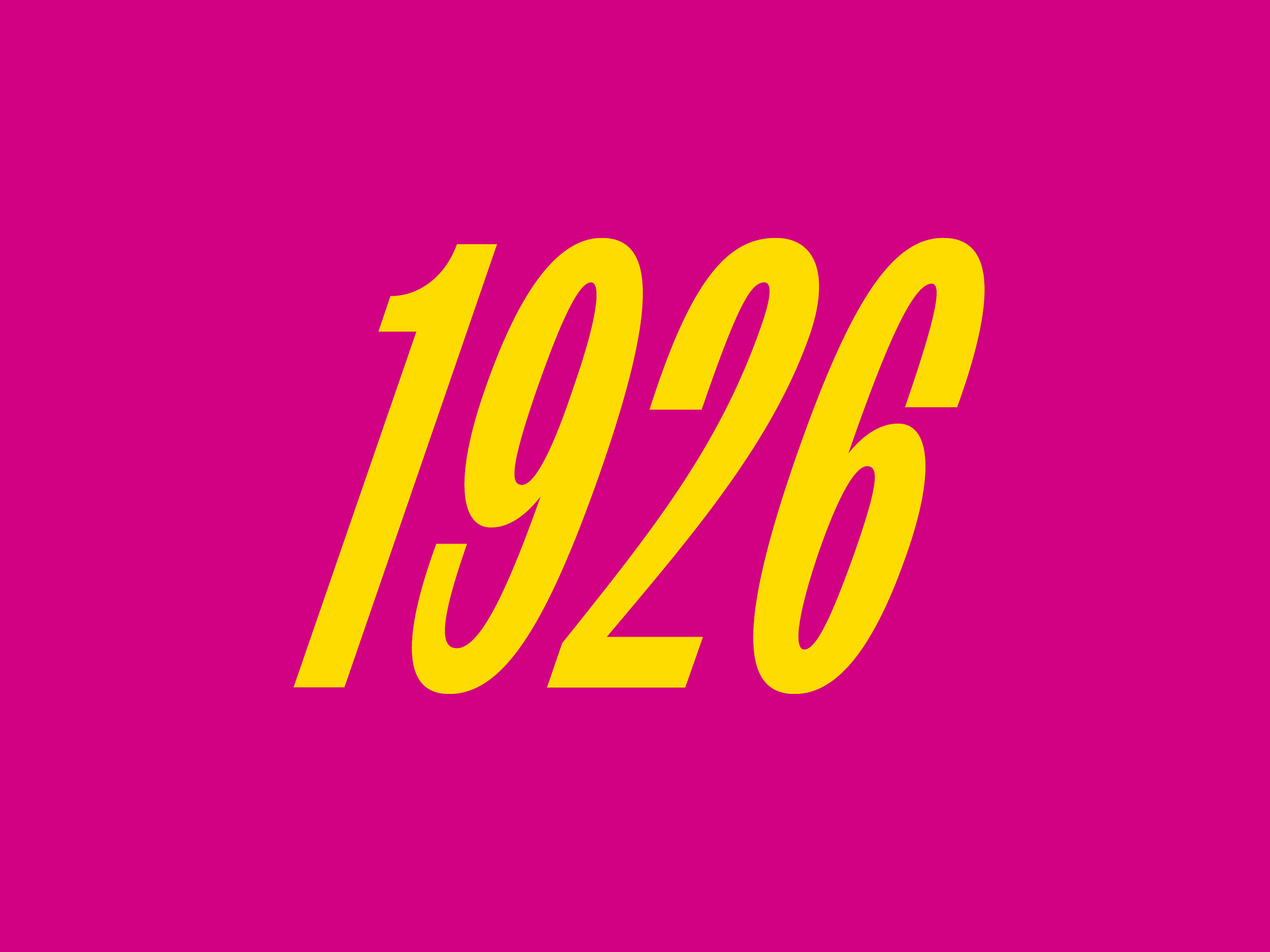
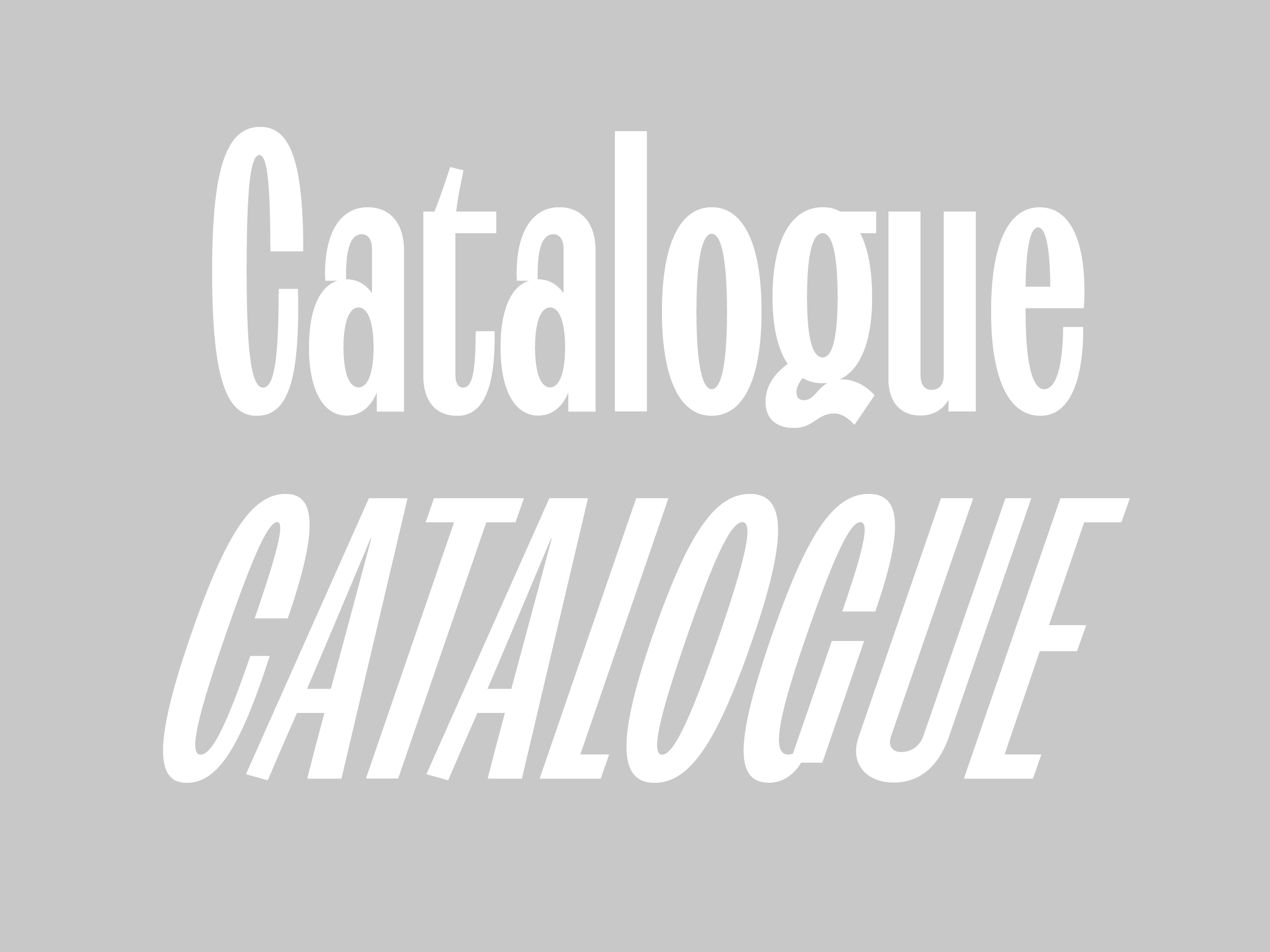
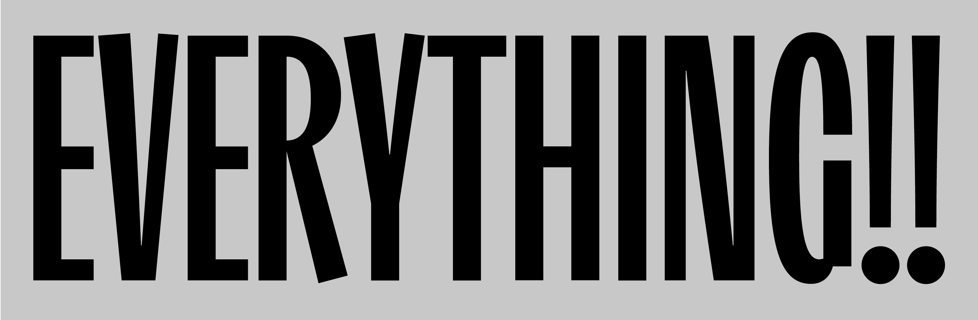
The typeface was inspired by old hungarian posters from the beginning of the XX. century. I’ve collected my favourite shapes, and created a whole new typeface from the beginning. The letters are very condensed, they have some contrast, the terminals of the diagonal characters are not horizontal (A,W,w…). We used the typeface for titles, sometimes with very tight leading, that’s why the descenders are very short, almost nothing. The italic letters are slanted with 19° referring to the theme of the exhibition: May Day 1919.
See more about the typeface here.